A ConstraintLayout is similar to a RelativeLayout, but with more power. The aim of ConstraintLayout is to improve the performance of the applications by removing the nested views with a flat and flexible design.
ConstraintLayout allows you to create large and complex layouts with a flat view hierarchy (no nested view groups). It’s similar to RelativeLayout in that all views are laid out according to relationships between sibling views and the parent layout, but it’s more flexible than RelativeLayout and easier to use with Android Studio’s Layout Editor.
Add ConstraintLayout to your project
To use ConstraintLayout in your project, proceed as follows:
- Ensure you have the
maven.google.comrepository declared in your module-levelbuild.gradlefile:repositories { maven { url 'https://maven.google.com' } }
- Add the library as a dependency in the same
build.gradlefile:dependencies { compile 'com.android.support.constraint:constraint-layout:1.0.2' }
- In the toolbar or sync notification, click Sync Project with Gradle Files.
Now you’re ready to build your layout with ConstraintLayout.
Convert a layout
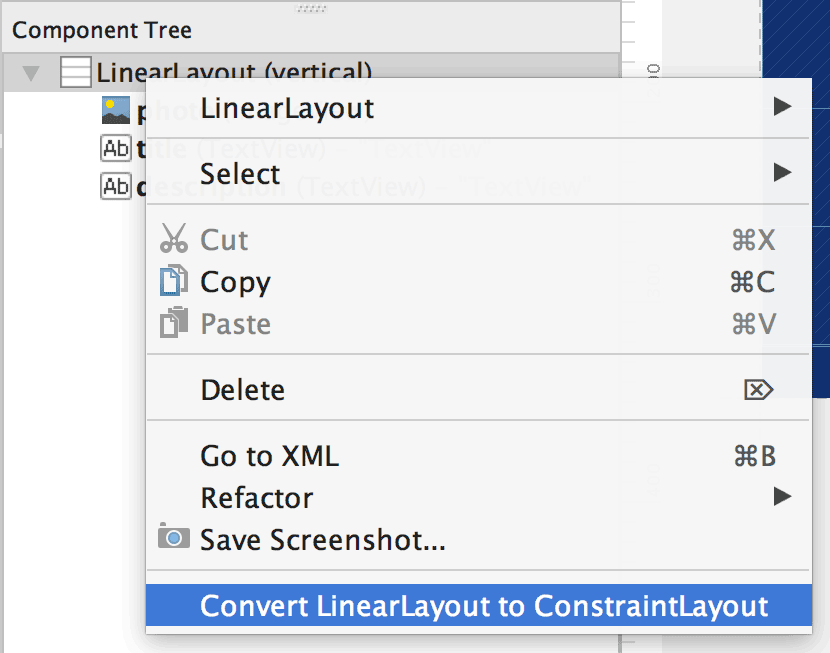
To convert an existing layout to a constraint layout, follow these steps:
- Open your layout in Android Studio and click the Design tab at the bottom of the editor window.
- In the Component Tree window, right-click the layout and click Convert layoutto ConstraintLayout.
Adjust the view size (view inspector)
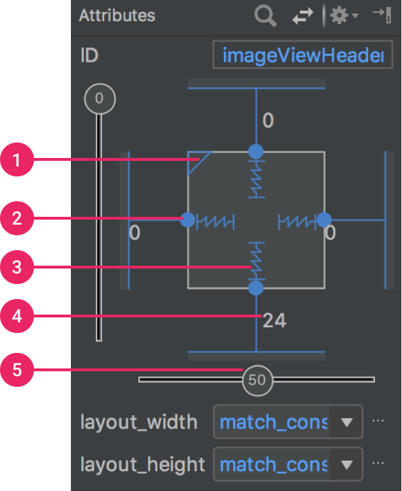
The Attributes window includes controls for 1) size ratio, 2) delete constraint, 3) height/width mode, 4) margins, and 5) constraint bias.
You can change the way the height and width are calculated by clicking the symbols indicated with call out 3 in above figure.
 Fixed: Specify the width/height of the element
 Wrap Content: The view expands only as much as needed to fit its contents.
 Match Constraints: The view expands as much as possible to meet the constraints on each side (after accounting for the view’s margins). However, you can modify that behavior with the following attributes and values (these attributes take effect only when you set the view width to match constraints):
- layout_constraintWidth_default
- spread: Expands the view as much as possible to meet the constraints on each side. This is the default behavior.
- wrap: Expands the view only as much as needed to fit its contents, but still allows the view to be smaller than that if the constraints require it. So the difference between this and using Wrap Content (above), is that setting the width to Wrap Content forces the width to always exactly match the content width; whereas using Match Constraints with layout_constraintWidth_default set to wrap also allows the view to be smaller than the content width.
- layout_constraintWidth_min: This takes a
dpdimension for the view’s minimum width. - layout_constraintWidth_max: This takes a
dpdimension for the view’s maximum width.
However, if the given dimension has only one constraint, then the view expands to fit its contents. Using this mode on either the height or width also allows you to set a size ratio.
- layout_constraintWidth_default
Baseline alignment
Align the text baseline of a view to the text baseline of another view.
To create a baseline constraint, select the text view you want to constrain and then click Edit Baseline
 , which appears below the view. Then click the text baseline and drag the line to another baseline.
Constrain to a guideline
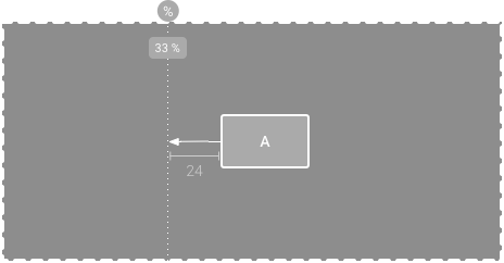
You can add a vertical or horizontal guideline to which you can constrain views, and the guideline will be invisible to app users. You can position the guideline within the layout based on either dp units or percent, relative to the layout’s edge.
To create a guideline, click Guidelines in the toolbar, and then click either Add Vertical Guideline or Add Horizontal Guideline.
Drag the dotted line to reposition it and click the circle at the edge of the guideline to toggle the measurement mode.
Note: If you are not seeing guideline or barrier option in toolbar, then change dependency to:
implementation 'com.android.support.constraint:constraint-layout:1.1.0-beta6'
Constrain to a barrier
Similar to a guideline, a barrier is an invisible line that you can constrain views to. Except a barrier does not define its own position; instead, the barrier position moves based on the position of views contained within it. This is useful when you want to constrain a view to the a set of views rather than to one specific view.
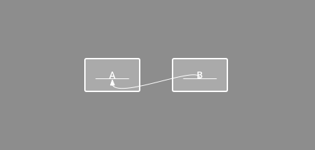
For example, below figure shows view C is constrained to the right side of a barrier. The barrier is set to the “end” (or the right side in a left-to-right layout) of both view A and view B. So the barrier moves depending on whether the right side of view A or view B is is farthest right.
To create a barrier, follow these steps:
- Click Guidelines in the toolbar, and then click Add Vertical Barrier or Add Horizontal Barrier.
- In the Component Tree window, select the views you want inside the barrier and drag them into the barrier component.
- Select the barrier from the Component Tree, open the Attributes
 window, and then set the barrierDirection.
Now you can create a constraint from another view to the barrier.
You can also constrain views that are inside the barrier to the barrier. This way, you can ensure that all views in the barrier always align to each other, even if you don’t know which view will be the longest or tallest.
You can also include a guideline inside a barrier to ensure a “minimum” position for the barrier.
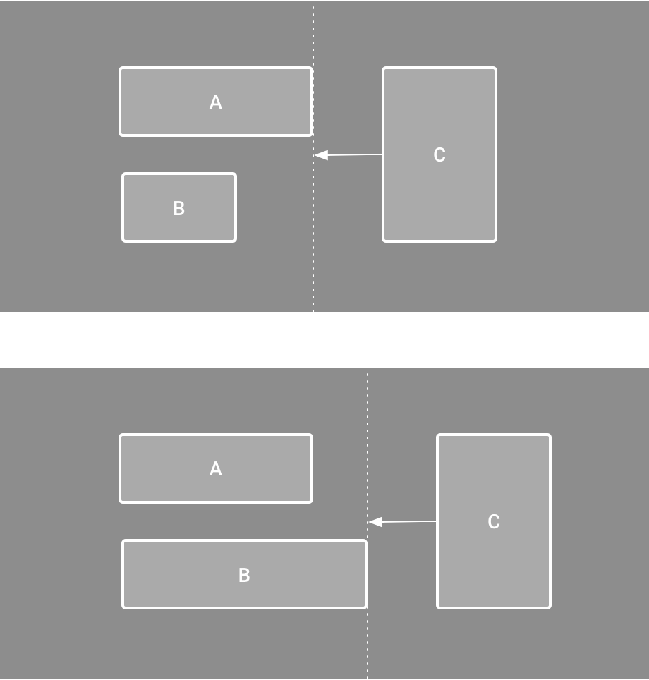
Figure. View C is constrained to a barrier, which moves based on the position/size of both view A and view B
Control linear groups with a chain
A chain is a group of views that are linked to each other with bi-directional position constraints.
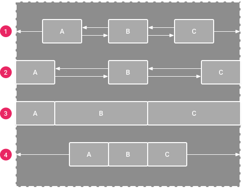
Figure. Examples of each chain style
A chain allows you to distribute a group of views horizontally or vertically with the following styles:
- Spread: The views are evenly distributed (after margins are accounted for). This is the default.
- Spread inside: The first and last view are affixed to the constraints on each end of the chain and the rest are evenly distributed.
- Weighted: When the chain is set to either spread or spread inside, you can fill the remaining space by setting one or more views to “match constraints” (
0dp). By default, the space is evenly distributed between each view that’s set to “match constraints,” but you can assign a weight of importance to each view using thelayout_constraintHorizontal_weightandlayout_constraintVertical_weightattributes. If you’re familiar withlayout_weightin a linear layout, this works the same way. So the view with the highest weight value gets the most amount of space; views that have the same weight get the same amount of space. - Packed: The views are packed together (after margins are accounted for). You can then adjust the whole chain’s bias (left/right or up/down) by changing the chain’s head view bias.
Automatically create constraints
Instead of adding constraints to every view as you place them in the layout, you can move each view into the positions you desire, and then click Infer Constraints  to automatically create constraints.
Infer Constraints scans the layout to determine the most effective set of constraints for all views. It makes a best effort to constrain the views to their current positions while allowing flexibility. You might need to make some adjustments to be sure the layout responds as you intend for different screen sizes and orientations.
Autoconnect is a separate feature that is either on or off. When turned on, it automatically creates two or more constraints for each view as you add them to the layout, but only when appropriate to constrain the view to the parent layout. Autoconnect does not create constraints to other views in the layout.
Autoconnect is disabled by default. You can enable it by clicking Turn on Autoconnect  in the Layout Editor toolbar.
Following are the differences/advantages:
1) Constraint Layout has dual power of both Relative Layout as well as Linear layout: Set relative positions of views ( like Relative layout ) and also set weights for dynamic UI (which was only possible in Linear Layout).
2) A very powerful use is grouping of elements by forming a chain. This way we can form a group of views which as a whole can be placed in a desired way without adding another layer of hierarchy just to form another group of views.
3) In addition to weights, we can apply horizontal and vertical bias which is nothing but the percentage of displacement from the centre. ( bias of 0.5 means centrally aligned. Any value less or more means corresponding movement in the respective direction ) .
4) Another very important feature is that it respects and provides the functionality to handle the GONE views so that layouts do not break if some view is set to GONE through java code.
5) Provides power of automatic constraint applying by the use of Blue print and Visual Editor tool which makes it easy to design a page.
All these features lead to flattening of the view hierarchy which improves performance and also helps in making responsive and dynamic UI which can more easily adapt to different screen size and density.
References:
https://developer.android.com/training/constraint-layout/index.html
https://codelabs.developers.google.com/codelabs/constraint-layout/#1
https://android-developers.googleblog.com/2017/08/understanding-performance-benefits-of.html
https://stackoverflow.com/questions/48990029/constraint-layout-chains
 Android Creativity